LnRiLWZpZWxke21hcmdpbi1ib3R0b206MC43NmVtfS50Yi1maWVsZC0tbGVmdHt0ZXh0LWFsaWduOmxlZnR9LnRiLWZpZWxkLS1jZW50ZXJ7dGV4dC1hbGlnbjpjZW50ZXJ9LnRiLWZpZWxkLS1yaWdodHt0ZXh0LWFsaWduOnJpZ2h0fS50Yi1maWVsZF9fc2t5cGVfcHJldmlld3twYWRkaW5nOjEwcHggMjBweDtib3JkZXItcmFkaXVzOjNweDtjb2xvcjojZmZmO2JhY2tncm91bmQ6IzAwYWZlZTtkaXNwbGF5OmlubGluZS1ibG9ja311bC5nbGlkZV9fc2xpZGVze21hcmdpbjowfQ==
IC50Yi1pbWFnZXtwb3NpdGlvbjpyZWxhdGl2ZTt0cmFuc2l0aW9uOnRyYW5zZm9ybSAwLjI1cyBlYXNlfS53cC1ibG9jay1pbWFnZSAudGItaW1hZ2UuYWxpZ25jZW50ZXJ7bWFyZ2luLWxlZnQ6YXV0bzttYXJnaW4tcmlnaHQ6YXV0b30udGItaW1hZ2UgaW1ne21heC13aWR0aDoxMDAlO2hlaWdodDphdXRvO3dpZHRoOmF1dG87dHJhbnNpdGlvbjp0cmFuc2Zvcm0gMC4yNXMgZWFzZX0udGItaW1hZ2UgLnRiLWltYWdlLWNhcHRpb24tZml0LXRvLWltYWdle2Rpc3BsYXk6dGFibGV9LnRiLWltYWdlIC50Yi1pbWFnZS1jYXB0aW9uLWZpdC10by1pbWFnZSAudGItaW1hZ2UtY2FwdGlvbntkaXNwbGF5OnRhYmxlLWNhcHRpb247Y2FwdGlvbi1zaWRlOmJvdHRvbX0gLndwLWJsb2NrLWltYWdlLnRiLWltYWdlW2RhdGEtdG9vbHNldC1ibG9ja3MtaW1hZ2U9ImQwMjBmZmU0NzQ4MTA0MDA4ZmMxYzQxNDE4YmEyMzI5Il0geyBtYXgtd2lkdGg6IDEwMCU7IH0gIEBtZWRpYSBvbmx5IHNjcmVlbiBhbmQgKG1heC13aWR0aDogNzgxcHgpIHsgIC50Yi1pbWFnZXtwb3NpdGlvbjpyZWxhdGl2ZTt0cmFuc2l0aW9uOnRyYW5zZm9ybSAwLjI1cyBlYXNlfS53cC1ibG9jay1pbWFnZSAudGItaW1hZ2UuYWxpZ25jZW50ZXJ7bWFyZ2luLWxlZnQ6YXV0bzttYXJnaW4tcmlnaHQ6YXV0b30udGItaW1hZ2UgaW1ne21heC13aWR0aDoxMDAlO2hlaWdodDphdXRvO3dpZHRoOmF1dG87dHJhbnNpdGlvbjp0cmFuc2Zvcm0gMC4yNXMgZWFzZX0udGItaW1hZ2UgLnRiLWltYWdlLWNhcHRpb24tZml0LXRvLWltYWdle2Rpc3BsYXk6dGFibGV9LnRiLWltYWdlIC50Yi1pbWFnZS1jYXB0aW9uLWZpdC10by1pbWFnZSAudGItaW1hZ2UtY2FwdGlvbntkaXNwbGF5OnRhYmxlLWNhcHRpb247Y2FwdGlvbi1zaWRlOmJvdHRvbX0gIH0gQG1lZGlhIG9ubHkgc2NyZWVuIGFuZCAobWF4LXdpZHRoOiA1OTlweCkgeyAgLnRiLWltYWdle3Bvc2l0aW9uOnJlbGF0aXZlO3RyYW5zaXRpb246dHJhbnNmb3JtIDAuMjVzIGVhc2V9LndwLWJsb2NrLWltYWdlIC50Yi1pbWFnZS5hbGlnbmNlbnRlcnttYXJnaW4tbGVmdDphdXRvO21hcmdpbi1yaWdodDphdXRvfS50Yi1pbWFnZSBpbWd7bWF4LXdpZHRoOjEwMCU7aGVpZ2h0OmF1dG87d2lkdGg6YXV0bzt0cmFuc2l0aW9uOnRyYW5zZm9ybSAwLjI1cyBlYXNlfS50Yi1pbWFnZSAudGItaW1hZ2UtY2FwdGlvbi1maXQtdG8taW1hZ2V7ZGlzcGxheTp0YWJsZX0udGItaW1hZ2UgLnRiLWltYWdlLWNhcHRpb24tZml0LXRvLWltYWdlIC50Yi1pbWFnZS1jYXB0aW9ue2Rpc3BsYXk6dGFibGUtY2FwdGlvbjtjYXB0aW9uLXNpZGU6Ym90dG9tfSAgfSA=
Matthew, Thomas, Gabby, Ton

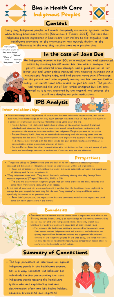
Wow, Matthew, Thomas, Gabby, Ton, might I say, the poster looks amazing aesthetically. It is very pleasing to the eyes. If it were on a wall I would definitely take the time to read it. I also appreciate the yellow orange colour you used. It alludes to truth and reconciliation, which definitely ties into healthcare as there is still so much work that needs to be done. I enjoy the caricatures on the poster, it adds a lot personality. However, when I take a step back to look at the poster, I feel like there is too much writing. I believe a lot of your points could be shortened and made more concise. For example, under Context, the second sentence is a run on sentence. I found it hard to follow along and grasp the meaning and had to read the sentence over a few times. This sentence could definitely be rewritten or made into multiple sentences to make it more comprehensible. Good job, on the summary of connections, it was easy to understand, to the point, and short and sweet. Overall, job well done, I look forward to seeing the final poster and presentation.
Hi Matthew, Thomas, Gabby, and Ton! Firstly I would like to say that the layout of your poster makes it very easy to read. The colours are not too distracting, but instead, add a nice aesthetic look to your poster. The images added are very eye-catching and add a very nice touch to the poster without taking the focus away from the writing. At first glance, the poster appears to have a lot of writing, which can be overwhelming, however, at the top of your poster your team added the “context” portion which was very helpful. Relaying to the audience as to why this topic is relevant and important is a great way to start the poster. I appreciate how you distinctly separated each topic you were discussing; however, it would be nice to see the sub-headings bolded, such as inter-relationships within patient-system, patient-nurse, etc. After reading your content, I enjoyed how you linked all IPB parts to your specific case. Not only did you link the case, but your group added quotes from the research you found. It is clear that your group took the time to educate yourselves on the topic. I think it would be beneficial to add the in-text citations as a footnote, instead of listing the authors on the poster. By doing so, extra distractions that take away from your wonderful content will be avoided. I struggled a bit to find the solutions your group established for your case. As a suggestion, it could be helpful to make a separate section for solutions or make the text stand out more in the paragraphs. However, the solutions provided on the poster are great and easy ways for all healthcare workers to utilize in their practice when speaking with any patient population, especially the vulnerable population. Overall, the poster was very well done with great content that is useful to apply to all healthcare practices.
Hello, Thomas, Gabby, Matthew, and Ton.
Wow! I am very impressed with your poster! Upon first glance it is very aesthetically and visual appealing. I think you found a good theme that fit your topic well. I think you covered your topic well throughout the poster. I also like that quotes at the topic of the poster of unfortunate phrases that get used sometimes against indigenous peoples seeking health care. In each subheading under inter-relations and boundaries I think it may be helpful for future readers if you bolded them, so they pop out more and are easier to find on the poster. I think it’s great you added relevant recent quotes to the perspective part in actual quotations. I think it makes it feel more personable to the case. I was not able to easily find your solutions on your poster, so maybe in the final draft you can add that and make it clearly labeled. You have all the components of the IPB framework on your poster and explain them all well in regard to the case study. I think your group especially did a good job at the interrelationship component of IPB. I liked that your group just gave the readers exactly what we needed to know in this section and did not over explain each perspective. I think you also did a good job of identifying a problem and a population in your “context” portion without making it too wordy as well. In your final draft of your poster, I would suggest leaving out the definition for interpersonal relationships, as I do not think it is necessary for the poster. All in all, I think your group did a great job!
Hi Matthew, Thomas, Gabby, Ton,
Firstly, I would like to say your poster is very visually appealing. I love the colours you chose, as they draw attention to your poster without being too overwhelming. I also like how your photos compliment your chosen colours. One thing I noticed when first looking at your poster is I felt overwhelmed by the amount of text present, I would recommend potentially shortening some of your sentences. I also found some of the text difficult to read, specifically the bullet points underneath your IPB analysis. By shortening some of your other texts it could allow for these points to be a bigger font, making it easier to read. My last bit of feedback would be to potentially change the colour of “interrelationships”, “perspectives” and “boundaries”. While the shade of yellow is again very visually appealing, I found that the titles blend in with the text boxes so as a reader I am not drawn to the titles. I also liked your “perspectives” as I found you utilised your references very well. I like how you quoted your references then applied them to your case. Overall, great job everyone!